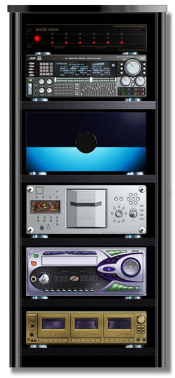
"An un-named audio corporation"
Image Editing
Over the past few years I have had the pleasure of working on various phases of the In-store marketing presentations of the Lifestyle System for this company whose-name-shall-not-be-mentioned. I was brought in to provide storyboards and sequence development, but before it was all over I had slipped into the role of the Photoshop fix-it guy. It was my first opportunity to do extensive retouching and I was pleased with the results overall (as were they) while learning about the efficacy of various techniques as well as the practical limitations of certain types of image editing.
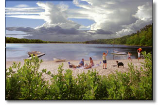
"Listening to Life" & "True to Life" Photo Fixes
Storyboards
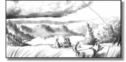
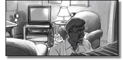
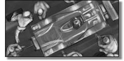
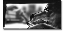
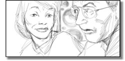
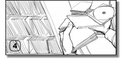
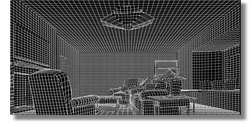
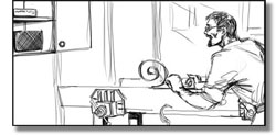
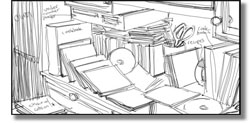
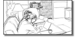
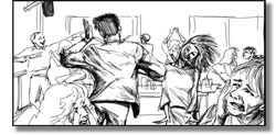
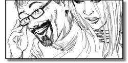
The type of storyboarding done for this company falls under the category of production (or shooting) boards. The development of these shows is a collaborative process not unlike that of a film or video project in that it includes producers, writers, photographers/ videographers, CGI designers, sound designers, location scouts, associates, assistants and assorted others at any given time. With so many people involved it is important to make certain (as best as possible) to keep everyone on the same page as to what the outcome will look like (what it sounded like was up to the Maestro Steve Ruggere and his hardy band to sound magicians.) Over months of preparatory meetings as the script took form, various ideas and sequences were proposed. The ones that seemed to have promise were written or refined and if they still had 'legs' I would be asked to provide a storyboard for everyone to look at so we could all further evaluate the idea. In some cases I was simply visually notating camera angles and elements that were suggested by the script, but in others I was asked to develop sequences that told the story. Most of these boards are of the "down 'n dirty" sort and hundreds of frames were produced for each show so I'll just include a few sequences.
